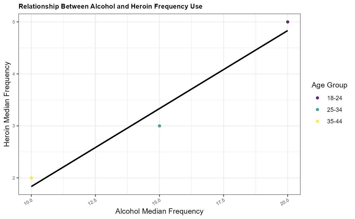
Function to create scatter plot with regression line
Source:R/eda_functions.R
create_scatter_plot.RdFunction to create scatter plot with regression line
Arguments
- data
A .csv dataframe containing data to be plotted.
- x_var
A string specifying the x-axis variable.
- y_var
A string specifying the y-axis variable.
- color_var
A string specifying the color variable for the scatter plot.
- title
A string specifying the plot title.
- x_label
A string specifying the x-axis label.
- y_label
A string specifying the y-axis label.
- output_file
A string specifying the output file path for saving the plot.
Examples
sample_data <- data.frame(
 age = c("18-24", "25-34", "35-44"),
 alcohol.use = c(80, 75, 60),
 alcohol.frequency = c(20, 15, 10),
 marijuana.use = c(50, 30, 20),
 heroin.frequency = c(5, 3, 2),
 class = c("youth", "adult", "adult"),
 n = c(100, 200, 150)
)
create_scatter_plot(
sample_data,
"alcohol.frequency",
"heroin.frequency",
"age",
"Relationship Between Alcohol and Heroin Frequency Use",
"Alcohol Median Frequency",
"Heroin Median Frequency",
"output/eda-test/test5.png"
)
#> `geom_smooth()` using formula = 'y ~ x'
#> `geom_smooth()` using formula = 'y ~ x'