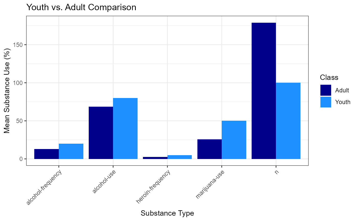
Function to create grouped bar plots
Examples
sample_aggregated <- data.frame(
 class = c(
 "adult", "adult", "adult", "adult", "adult",
 "youth", "youth", "youth", "youth", "youth"
 ),
 total_n = c(350, 350, 350, 350, 350, 100, 100, 100, 100, 100),
 variable = c(
 "alcohol-use", "alcohol-frequency", "marijuana-use", "heroin-frequency","n",
 "alcohol-use", "alcohol-frequency", "marijuana-use", "heroin-frequency", "n"
 ),
 value = c(68.6, 12.9, 25.7, 2.57, 179., 80, 20, 50, 5, 100)
)
create_grouped_bar_plot(
sample_aggregated,
"Youth vs. Adult Comparison",
"Substance Type",
"Mean Substance Use (%)",
"output/eda-test/test6.png"
)